Deliver Uplift
for E-Commerce Website
in 30 days
From design to implementation.
Project
Background
StickerHD, a well-known sticker printing company in Taiwan, was looking to upgrade their e-commerce website within a limited timeframe. The aim of this refinement was to reshape key user flows to promote their products, while emphasising brand impression and escalating user experience.
Our goal: a visually compelling, high-converting storefront — delivered in 30 days.My Role
in This Project
I served as lead product designer and front-end developer — actively initiating communication between stakeholders and the backend developer, illustrating the project roadmap, and delivering a new interface from scratch to live product.
Lead DesignerFrontend DeveloperNext.jsTailwind CSSReduxFigma Variables
Our Challenge
With an awareness of time constraints, we and the client concluded three main areas of improvement throughout our discussions.


Inconsistent
User Interface
The existing interface lacked consistency and failed to convey the brand concept precisely to customers.

Uninformative
Homepage
The homepage carries the responsibility of attracting and retaining customers. The existing design didn't perform on this mission.

Unsatisfied
Order Experience
The complex product page design failed to provide an easy and intuitive experience when customers ordered stickers.
A streamlined process to tackle pain points


RedefineA well-crafted design language
A well-crafted design language
aligned with brand identity
The existing design system was pieced together from various libraries and templates — it lacked a true connection to the brand. I rebuilt the system by extending from the brand's core spirit, placing greater emphasis on brand assets such as the mascot and colour palette. This created a stronger foundation, ensuring the product feels both consistent and authentically branded.

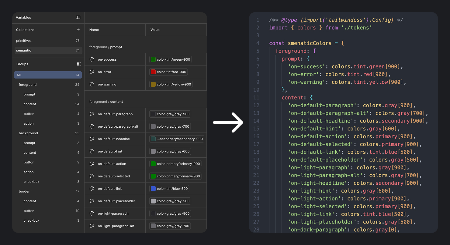
Colour Scheme
Context-driven colour logic
via design tokens
By refining the hue spectrum, we developed a clean and modern palette that carries intentional meaning at every level.
A two-tier design token architecture maps Primitive Tokens (raw brand hex values) to Semantic Tokens (contextual usage like action-primary-bg). Both layers sync directly to the Tailwind CSS config — enabling a handover-less workflow with zero redlining.

Illustration / Iconography / Pattern
Our signature touch —
unique patterns, unique brand
Inspired by the brand logo, we deconstructed and extended visual elements into patterns that give the interface a distinctive signature. To highlight the company's expertise, we placed holographic printing — its flagship product — at the centre of the homepage landing experience.
We also introduced hand-sketched illustrations that add an approachable, crafty vibe — making the brand feel more friendly and relatable to customers.
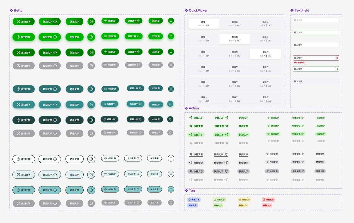
Design system
Consistency and refinement —
a design system that covers every detail
A good design system should guide designers in creating products that are consistent, refined, and cohesive. To achieve this, we refined the existing guidelines by addressing key issues — reducing excessive typographic options, clarifying the button hierarchy, and building a more consistent and meaningful colour logic.

RedesignRevamping key pages to enhance
Revamping key pages to enhance
the customer experience
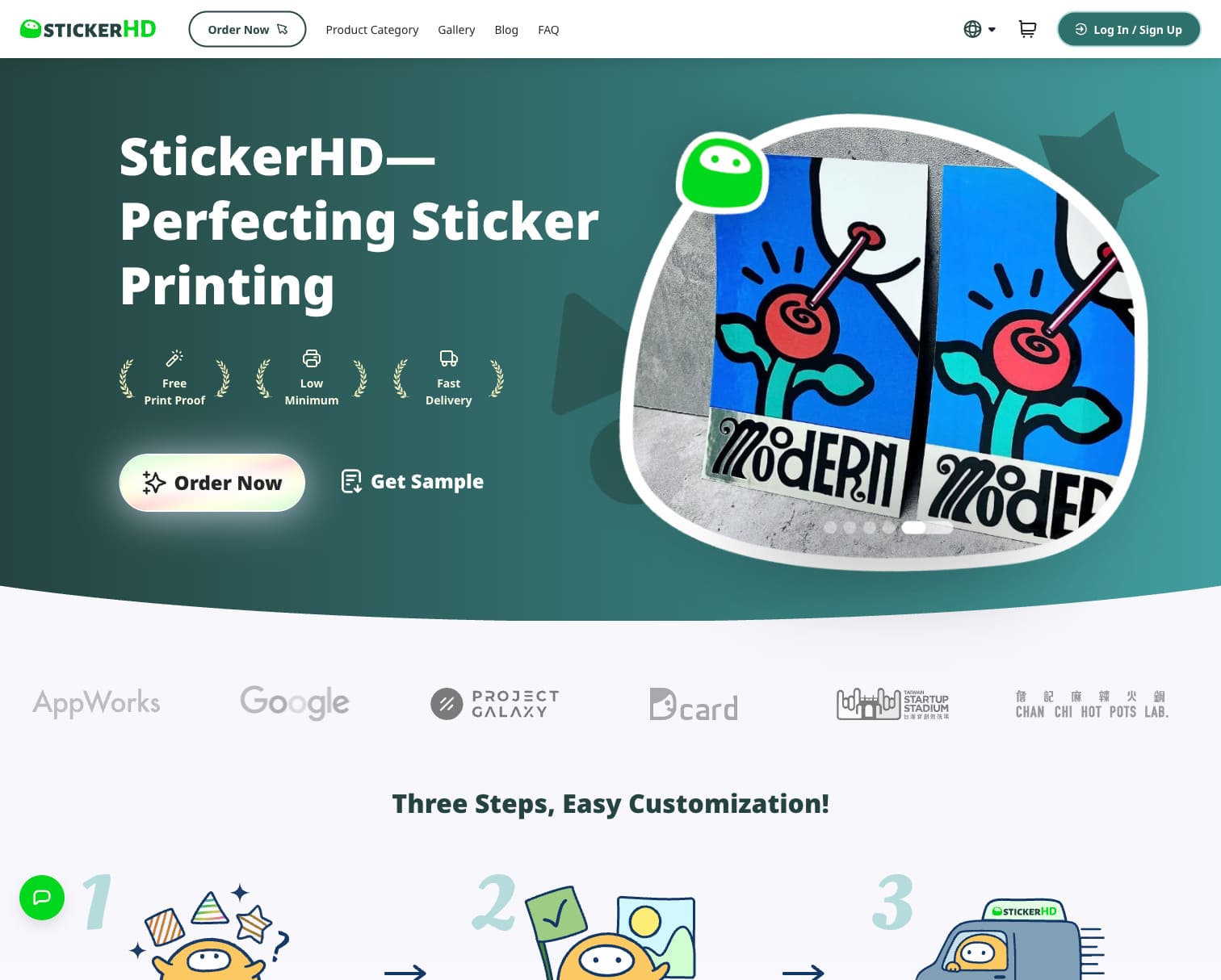
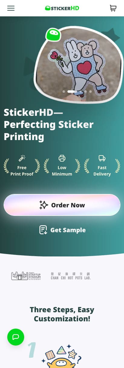
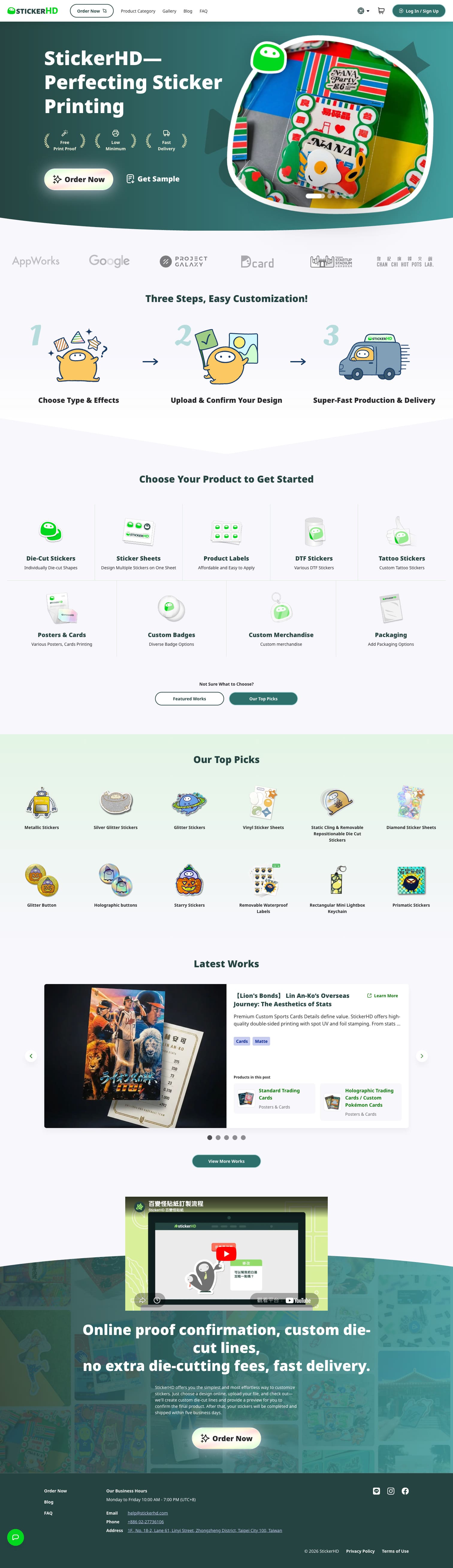
HOME
Original design
Lacking a compelling why
The initial homepage had the right calls to action — order now, product categories, featured items — but it didn't showcase the unique strengths that would convince customers to choose StickerHD over competitors. Visuals lacked appeal, making users less motivated to scroll and engage.
HOME
New design
A story that turns visitors into believers
The new design tells a compelling story for newcomers — showing them why they should choose StickerHD. From a strong landing section highlighting our signature work and unique services, to clear ordering steps, product showcases, and featured items. The journey concludes with a video that reinforces our strengths, leaving a lasting impression.
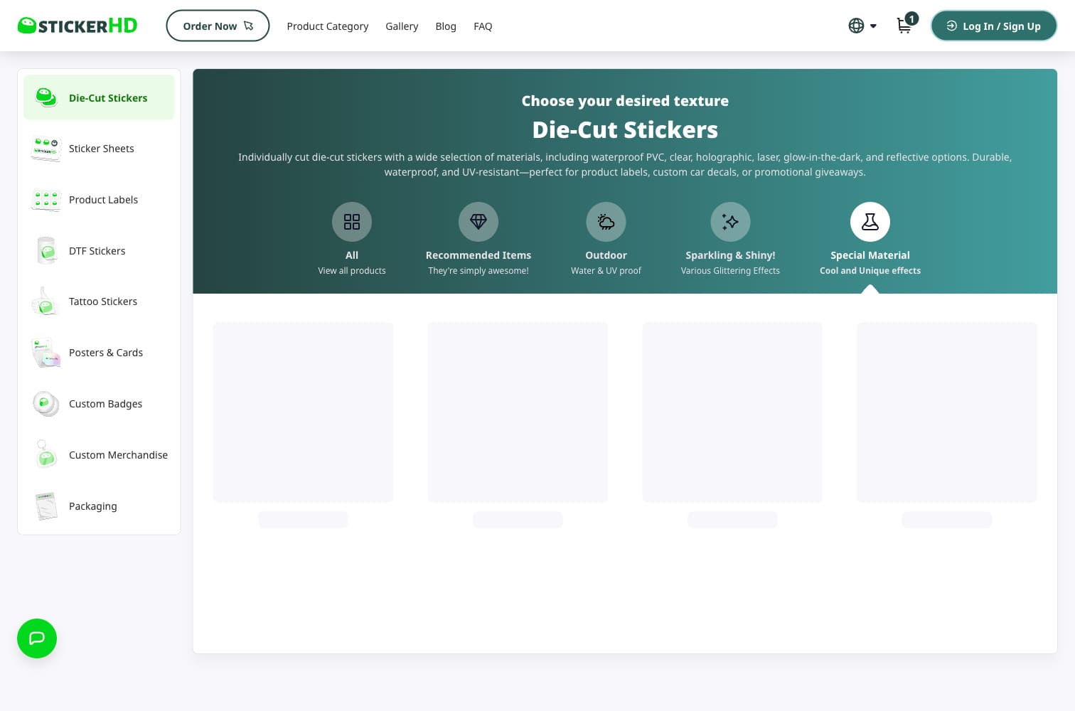
PRODUCT
A waterfall layout for
viewing and deciding
The redesigned product page presents a well-structured, form-like experience: material → size → finish → quantity → add to cart. The Dual-Column Layout keeps persistent product information anchored on the left while the right side provides a clear vertical decision path — reducing cognitive load at every step.
Before
After
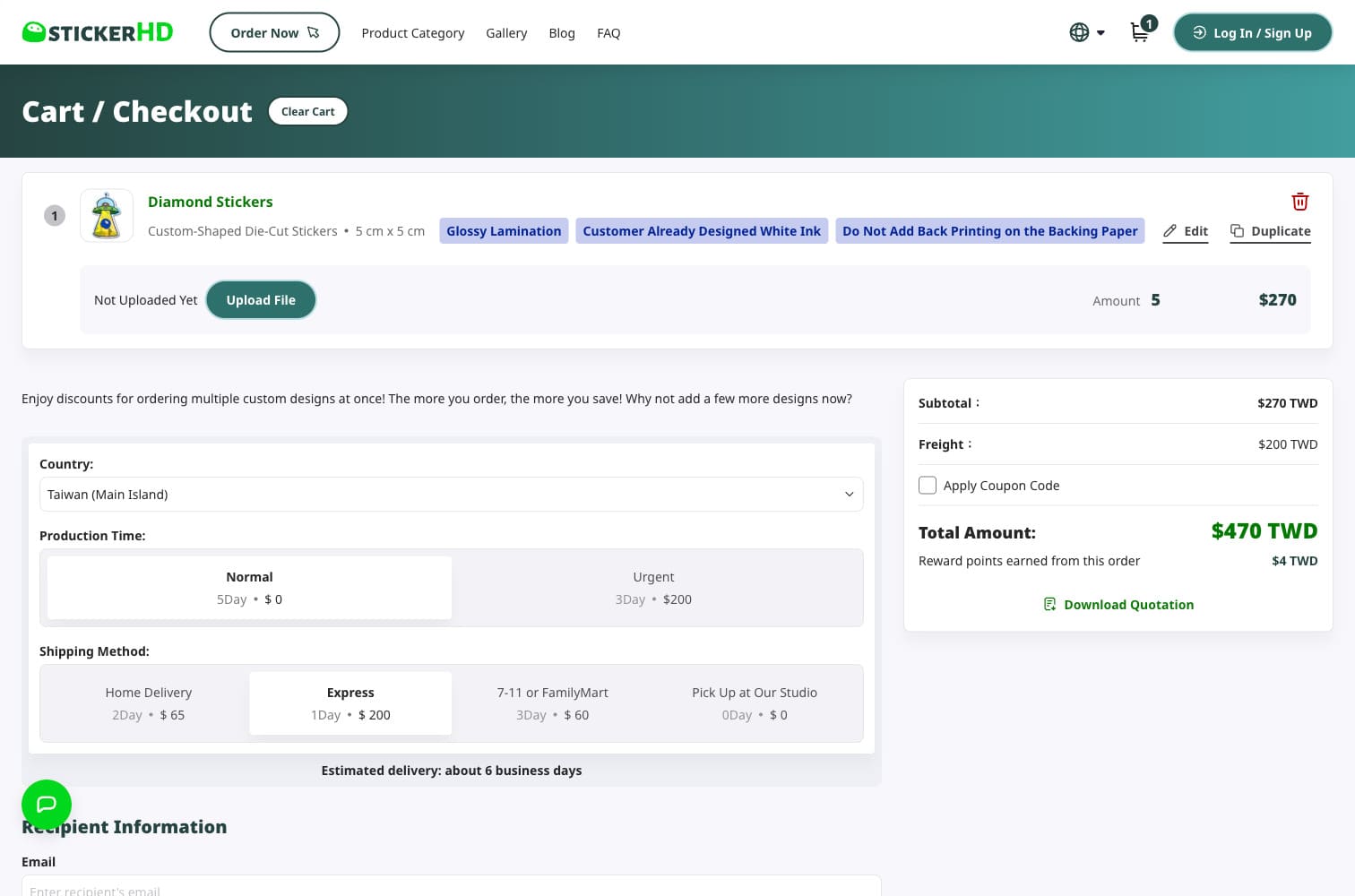
CART
A smarter checkout experience
built around how customers actually order
The redesigned cart clearly presents product details while streamlining how customers fill in their order specifics. The centrepiece is a dynamic delivery component that lets customers select their region and delivery method first — calculating freight on the fly and updating the total in real time.
This was especially critical for StickerHD: they offer a wide range of delivery options including urgent production and international shipping. Getting the pricing right before commitment removes the biggest friction point at the moment of purchase.

RestructureEngineering the experience
Engineering the experience
from code to delivery
With the design locked, I led the full front-end build — making deliberate engineering decisions to ensure the product was fast, maintainable, and handed off without friction.
Performance Engineering
Fast by design, not by accident
With e-commerce, every second of load time impacts conversion. I implemented three strategies across the stack:
- Skeleton Loading — eliminates layout shift during data fetch
- Next.js preloading — instant page transitions across product pages
- Redux caching — no redundant API calls on repeated product views
Design-to-Code Workflow
Handover-less: Figma Variables → Tailwind CSS
To win stakeholder buy-in for the full redesign, I first applied only the new token system to the existing homepage layout — without changing a single layout element. The visual improvement was immediate. That proved the ROI and unlocked the full redesign scope.
Primitive Tokens defined raw brand hex values in Figma Variables. Semantic Tokens mapped them to contextual usage (action-primary-bg, surface-default). Both layers synced directly to the Tailwind CSS config — with API contracts documented for the backend engineer, ensuring every spec was buildable with zero surprises at handoff.
OutcomeDelivered in 30 days,
Delivered in 30 days,
confirmed by the client
The new product page makes it so easy to pick what you want and place an order — we've seen more customers completing their purchases since the launch.
Conversion Rate
More customers are finding us and placing their first order. The homepage tells our story the right way now — it actually gives people a reason to choose us.
Sales Growth
The website feels so much more professional and trustworthy. Customers have been saying the whole ordering experience is just smoother and cleaner.
Customer Satisfaction
Try It Now
Let’s Create Miracle
Together !
UI/UX Designer &