Strategic Service Design · 2025

From fragmented systems
to a strategic blueprint.

Reimagining the authenticated student experience for a leading higher-education institution — moving the conversation from "what should it look like" to "what should we build, and why."

Strategic DesignUX ResearchUX DesignStakeholder ManagementAI-powered Workflow
My Role

Sole full-time Experience Designer, partnered with one Design Lead and a part-time intern.

Context

During my time as an Experience Design Analyst on the in-house service design team, I led the discovery and concept design of this strategic initiative — partnering with engineering, operations, and student-services leaders across the year.

Outcome

A solution-requirements blueprint and phased roadmap that secured executive endorsement and informed capital-funding allocation.

How might we improve the authenticated experience for current students?

Three pain points kept surfacing across every research session — and together, they framed the central question we set out to answer.

01
Disconnected Systems

Students must navigate multiple platforms for basic information, often starting outside the institution altogether via web search.

02
Constant Re-authentication

Persistently needing to log in between systems was the highest-priority pain point students surfaced, fragmenting otherwise simple tasks.

03
Opaque Support Processes

Students lose confidence chasing service requests through systems that don't reveal status — leading to unnecessary support calls and erosion of trust.

Conceptual illustration of a student moving from a fragmented digital experience toward a unified, intelligent one.
Our Vision: from disconnected systems, repeated authentication, and opaque support — toward a unified digital home, seamless action, and proactive intelligence.

A Double Diamond, in four deliberate moves.

The biggest risk in a strategic project is jumping to solutions before you understand the problem. The Double Diamond's enforced separation between problem framing and solution framing gave us — and our stakeholders — a shared map of where we were in the work, and what kind of decisions could be made at each point. Each phase was anchored by a question, an objective, a defined set of activities, and the outcomes we held it accountable for.

01

Discover

Guiding Question

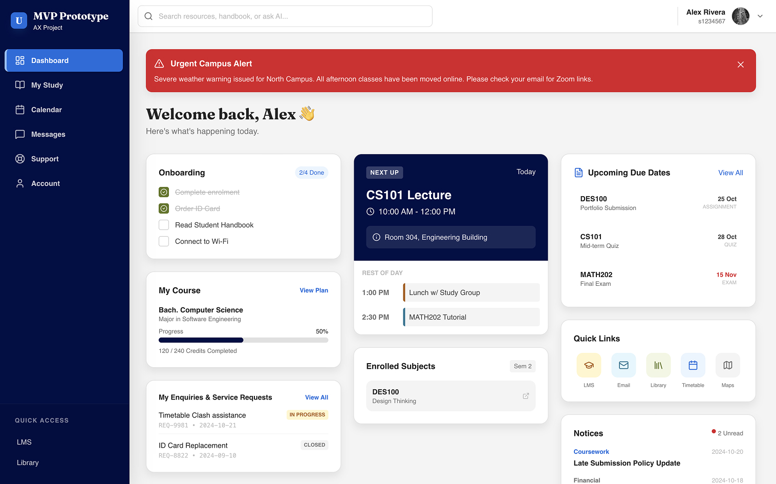
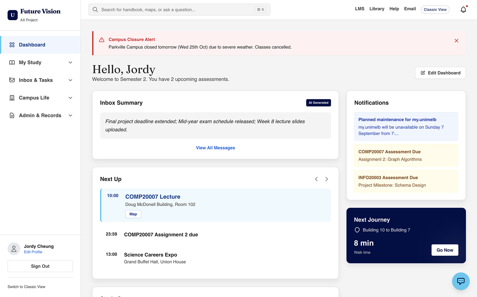
What problems are we solving with a student admin portal?

Objective

Build a clear understanding of the current landscape, user needs, and opportunities.
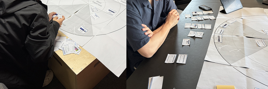
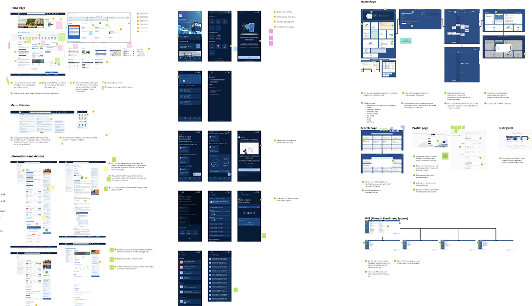
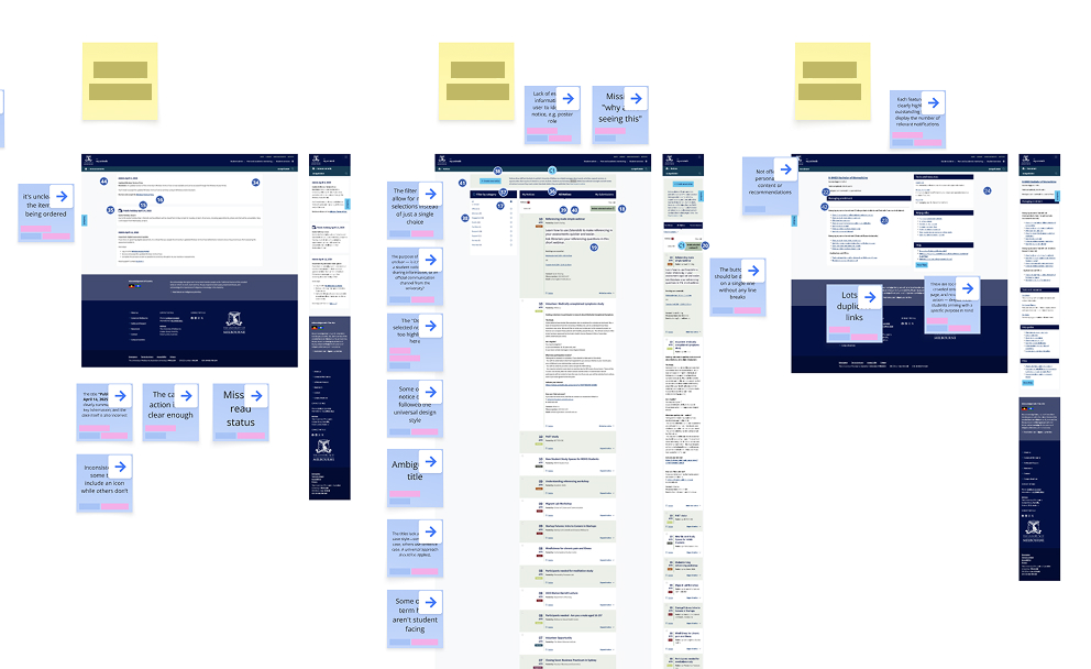
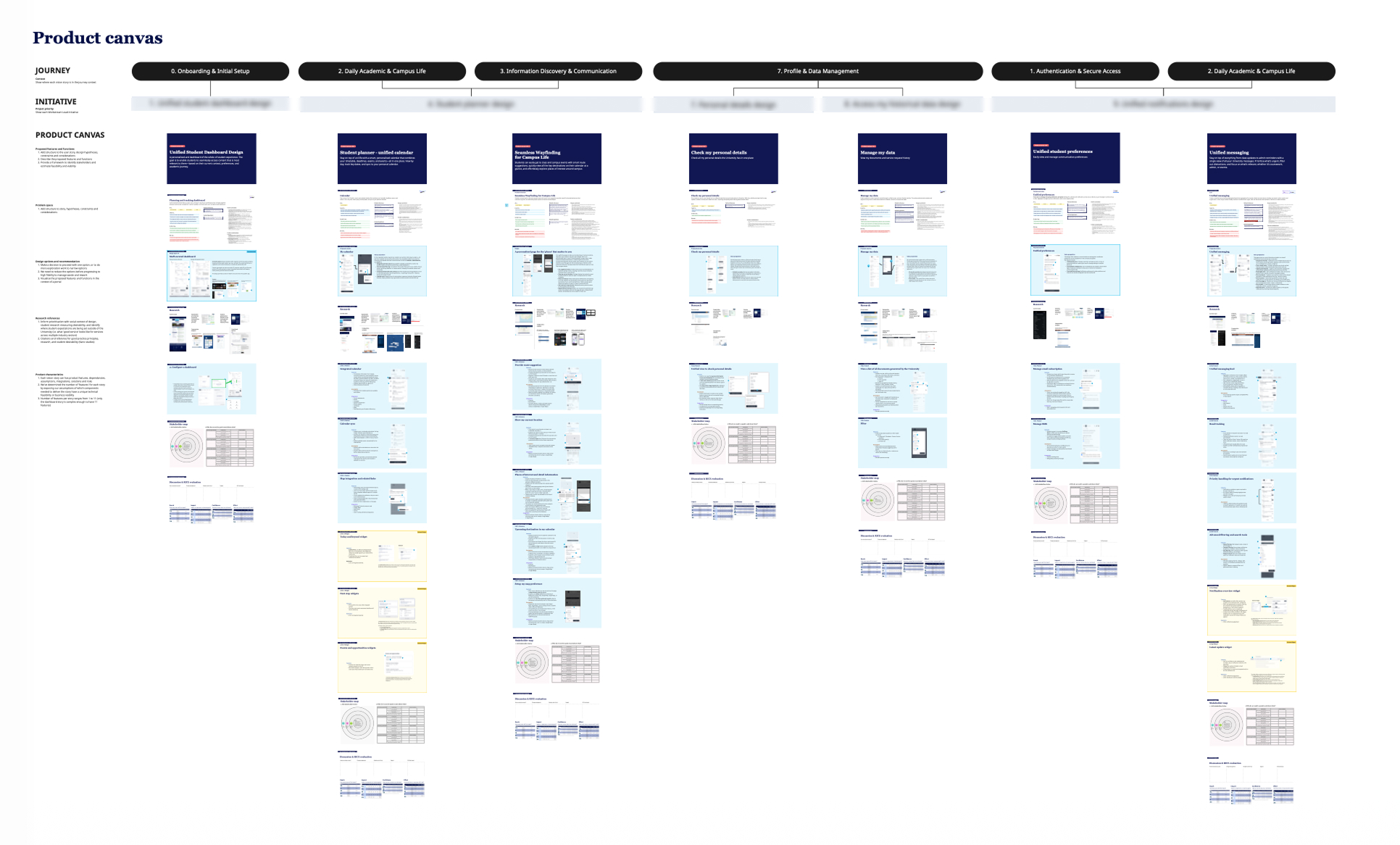
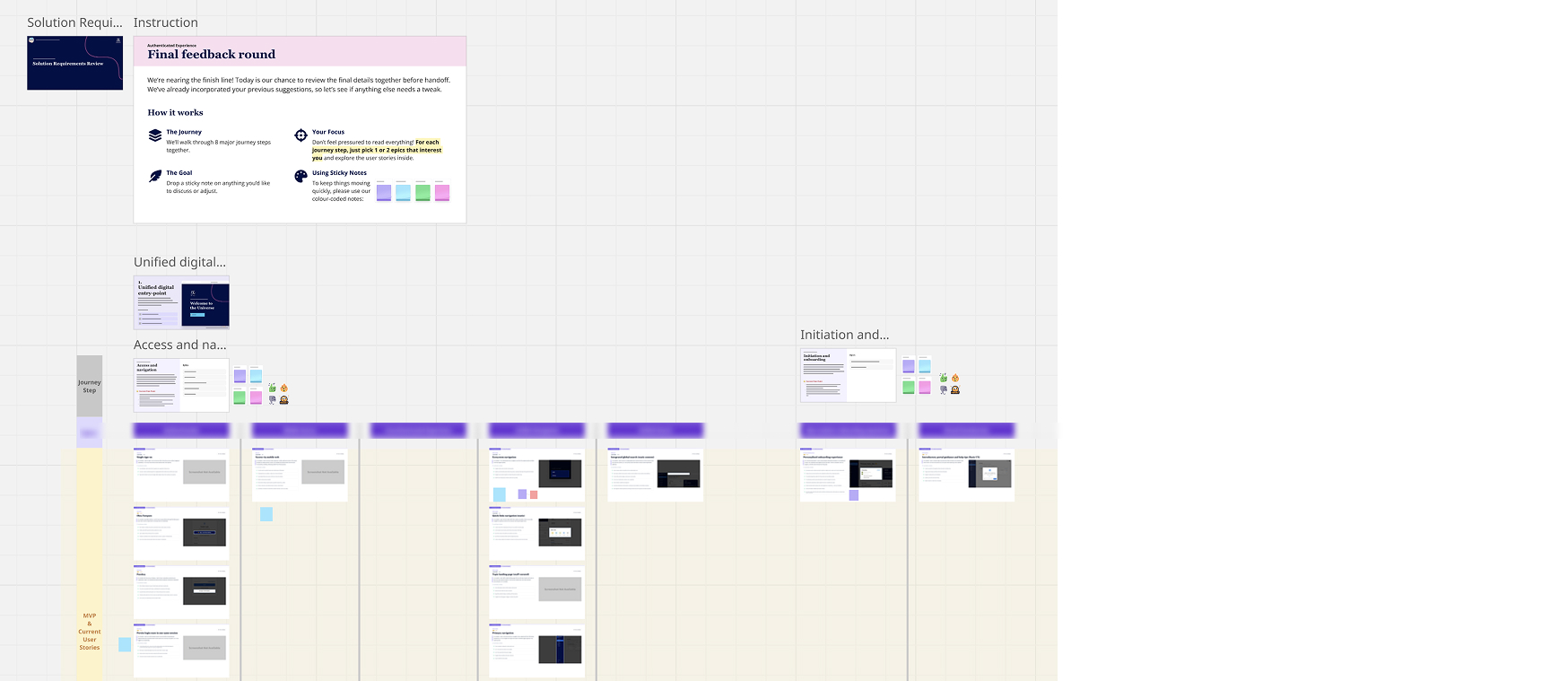
Activities
  • Heuristic review of the existing authenticated ecosystem
  • Comparative analysis against peer institutions
  • Discovery interviews and shadowing with students
  • Stakeholder context-setting workshops
Outcomes
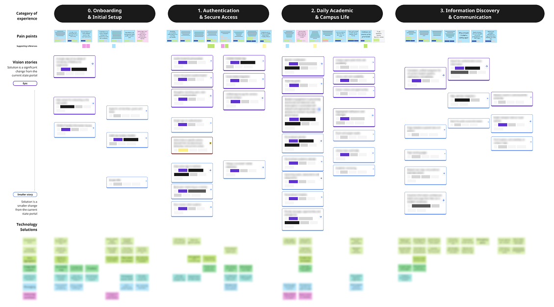
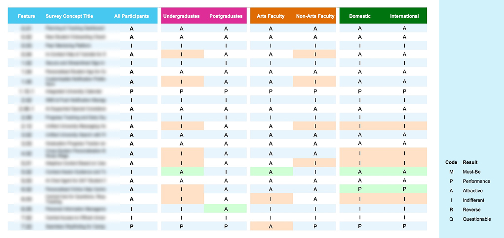
  • Identified key pain points across the student admin journey
  • Mapped user behaviours, contexts, and peer offerings
  • Surfaced quick wins achievable on the current technology stack
  • Gap analysis against peer-institution implementations
  • Catalogued emerging tech enabling personalisation and automation
02

Define

Guiding Question

How might we solve student problems with a digital self-service portal?

Objective

Explore potential solutions to student problems through digital self-service.

Activities
  • Translated insights into structured design hypotheses
  • Tested desirability of future-state product features with students
  • Pressure-tested feasibility of initiative themes with workstream leads
Outcomes
  • Comprehensive list of opportunities organised as conceptual themes
  • Shortlisted high-potential themes refined through student feedback
  • A strategic future-state vision combining new and in-flight improvements
  • Product features defined to support each shortlisted theme
03

Ideate

Guiding Question

How might we practically deliver digital service improvements with a portal?

Objective

Design conceptual solutions aligned with the program's strategic goals.

Activities
  • Designed target-state product features per theme
  • Assessment workshops with students, operations, and engineering
Outcomes
  • Conceptual designs for each feature, sized to enable meaningful estimation
  • Feasibility and viability estimates produced collaboratively with stakeholders
  • Cross-workstream alignment on operationalisation, case management, and support per theme
04

Deliver

Guiding Question

How might we prioritise the highest-impact, lowest-cost opportunities?

Objective

Prioritise next actions for design and prepare for implementation.

Activities
  • Concept design and prototype build aligned to the phased roadmap
  • Review and refinement of solution requirements and roadmap documentation
Outcomes
  • Clear focus on high-impact, low-cost opportunities
  • A collaboratively defined, phased solution implementation roadmap and concept design set
Illustration of the final solution blueprint, showing a phased roadmap and the strategic goals it serves.Final Outcome

A phased implementation roadmap that balances tactical quick wins with longer-term strategic goals — guiding decision-makers in establishing an enhanced, unified student experience aligned to institutional priorities and the technical roadmap.

A research arc, not a research dump —
each method earning the next one's right to exist.

We weren't trying to collect the most data — we were trying to build a chain of evidence stakeholders could not dismiss. The methods unfolded in deliberate sequence across the project's four phases, with each one answering a question the previous couldn't.

Discover

In-Depth Interviews

13 sessions

Every other method on this list earned its question from this one. Before frameworks, before scoring models, before stakeholders weighed in — we needed to hear from students themselves. Numbers describe scale; an interview describes meaning.

WHAT WE DID

Semi-structured sessions surfaced the lived friction behind the metrics and revealed the distinct mental models students brought to the ecosystem. Those mental models became the structural backbone for everything we recommended next.

Photo of a research participant during a remote interview session.
Discover

Comparative Analysis

Before designing anything new, we needed to know what students might already expect from a digital experience — and where the bar sat across comparable institutions and adjacent enterprise products.

What we did

Mapped feature inventories, navigation models, and personalisation approaches across peer institutional portals. Surfaced what was table-stakes, what was emerging best-practice, and where genuine differentiation could live.

Comparison of different institutional portal designs.
Discover

Heuristic Review

150+ pages audited

Before proposing what to build, we needed a defensible baseline of what was failing — and at what scale. Cost-effective: no recruitment, no scheduling, just structured analytical work.

What we did

Audited the existing pages within our ecosystem against established usability heuristics and best practices. Surfaced recurring patterns rather than isolated bugs — producing an inventory of design debt we could prioritise against.

Illustration of the heuristic review process.
Define

Design Hypothesis Brainstorming

Insights stay descriptive until you commit to a hypothesis. Without this step, research findings become a comfortable explanation for inaction. Hypothesis brainstorming forced the team to put each insight on the line as a testable bet — before falling in love with it.

What we did

Synthesis sessions translated raw signals from Discover into structured hypotheses. Each one became a candidate solution that the downstream methods — Kano survey, co-design workshops, feasibility reviews — could validate or kill on evidence rather than opinion.

Photo of a whiteboard filled with design hypotheses.
Define

Kano Survey

249 survey responses

Feature requests are infinite; budgets aren't. The Kano model gave us a quantitative lens on something traditionally driven by loudest-voice prioritisation.

What we did

Each candidate feature was classified as a Must-Be, a Performance Feature, or a Attractive. The framework gave us a calm, defensible answer when stakeholders pushed for personal favourites ahead of basic needs.

Illustration of the Kano result, showing how features are classified into basic needs, performance features, and delighters.
Ideate

Co-design Workshops

50+ participants

Interviews surface user truth. Workshops surface stakeholder ownership. We needed our recommendations to survive governance — and people defend what they helped build.

What we did

Brought stakeholders, business operations, and service owners into the same room to test future-state themes. The eventual direction wasn't a recommendation we delivered — it was a position they had helped form.

Photo of a co-design workshop session.
Deliver

Feasibility Assessment

6 technology sessions + 6 business sessions

Hopes don't fund roadmaps; cost estimates do. Without stress-testing each high-impact vision story against real engineering effort and operational viability, the prioritisation would have been theatre. This was the gate between "ideas we like" and "stories we can ship."

What we did

Two parallel tracks. Six workshops with the technology team estimated implementation effort against legacy systems, integrations, and platform constraints. Six conversations with business owners validated operational viability — governance load, support implications, and training cost. The two views collapsed into the Effort input that downstream RICE prioritisation depended on.

Photo of a feasibility assessment session with engineering stakeholders.

Findings, quotes, and segment-specific insights are intentionally omitted from this case study to respect institutional confidentiality. The methodology is the transferable part.

How we adopted RICE — turning 276 research insights into one comparable score per feature.

Synthesis is where strategy lives. We didn't use RICE as a calculator — we used it as the synthesis spine. Every research signal we collected, from interviews to feasibility workshops, fed into a single shared model that produced one priority score per candidate feature.

01
Collect

276 insights documented across every research activity — interviews, audits, surveys, workshops, feasibility sessions.

02
Categorise

Each insight tagged to the RICE dimension it spoke to. Tech feedback fed Effort; student pain fed Impact; peer benchmarks fed Confidence.

03
Score

Within its dimension, each insight got a 1–5 weight reflecting severity, scale, confidence, or build cost — depending on the bucket.

04
Aggregate & Score

Per candidate feature, contributing insight scores are aggregated statistically into R, I, C, and E values — then collapsed through the RICE formula into a single comparable priority score.

Where each research stream landed in the model.

R
Reach

Who is actually affected.

  • Student interview cohort breadth
  • Kano survey demographics
I
Impact

How much value if delivered.

  • Kano classification (basic / performance / delighter)
  • Severity of student pain points
  • Co-design priority signals
C
Confidence

How strong is the evidence.

  • Heuristic review (150+ pages audited)
  • Comparative analysis (peer benchmarks)
  • Cross-method validation
E
Effort

What's the realistic cost.

  • Technology feasibility (6 sessions)
  • Business viability (6 sessions)

The output wasn't just "25 vision stories." It was 25 stories that were both wanted by students and realistically deliverable inside the institutional roadmap. That's what made the deliverable fundable — not just persuasive.

From requirements document to a living, navigable prototype
— in days, not months.

The biggest unlock of the project was treating AI not as a generator of pretty screens, but as a way to compress the distance between writing a requirement and feeling what it would be like to use it. Stakeholders no longer needed imagination — they could click.

01

Solution Requirements as the Source of Truth

Each vision story was authored as a structured user story with acceptance criteria, dependencies, and the underlying research insight. This document wasn't an attachment — it was the contract the rest of the workflow read from.

Screenshot of a user story with acceptance criteria and research insight annotations.
Illustration of a connector, showing how the user story document feeds into the prototype.
02

Generative + Vibe-Coded Functional Prototype

We used GenAI tooling and vibe-coding workflows to translate those user stories directly into a working web prototype — not a Figma click-through, but real HTML you could navigate, tab through, and stress-test on mobile. Two parallel prototypes shipped: an MVP view, and a Target / Future State vision.

Screenshot of the MVP prototype.
Screenshot of the future state prototype.
Illustration of a connector, showing how the prototype feeds into the documentation site.
03

A Documentation Site That Holds the Whole Story

The final layer was a public-facing documentation site that wove research insights, RICE scores, journey steps, and the live prototypes into one browsable artefact. Decision-makers could move from a roadmap phase to a user story to a working screen in two clicks. Alignment stopped being a meeting; it became a hyperlink.

Screenshot of the documentation site.
Illustration of a connector, showing how the prototype feeds into the documentation site.
Why It Mattered

An interactive artefact removed the most expensive friction in enterprise design — re-explaining the same idea to a new audience.

The prototype and documentation site were directly cited in the materials that secured next-year capital funding for implementation.

The initiative's phased roadmap, showing how the MVP, Target State, and Future State features map to short-, mid-, and long-term horizons.

A roadmap is a decision-making artefact,
not a delivery plan.

The most strategic deliverable of the project was a phased roadmap framing the short-, mid-, and long-term ambition of the institution's authenticated experience. It gave leadership a way to talk about technology investment, governance, and future capability in the same shape — which is what allowed the conversation to escalate from a design project to a capital-funded program.

The point wasn't to predict the future accurately. It was to give the institution a shared horizon against which every near-term decision could be evaluated.

Short-term

Foundational Hub

Unify visibility of priority information. Reduce friction without rewriting legacy systems. Earn trust through what is shipped, not what is promised.

Pragmatic, low-risk, high-signal.
Mid-term

Seamless & Actionable

Move from viewing to doing. Bi-directional integrations let students complete priority tasks without context-switching across systems.

Capability investment with measurable lift.
Long-term

Proactive Intelligence

A learning system that anticipates needs, recommends pathways, and surfaces eligibility — informing not just product, but future technology selection.

Direction-setting for the next decade of investment.

A glimpse, not the focus.

Two interactive prototypes — MVP and Target/Future — were generated and refined through the AI-augmented workflow above. They are intentionally treated lightly here; the contribution worth showing is the methodology that produced them, not the screens themselves.

MVP
Screenshot of the MVP prototype.

Foundational hub — view here, do there.

Target / Future
Screenshot of the future state prototype.

Seamless, actionable, and proactively intelligent.

What this project taught me about
where designers add value.

The pivot — from mocks to blueprints.

When I joined the project, the natural instinct was to deliver a polished frontend redesign. Early conversations with engineering and operations made clear that legacy CMS constraints and entrenched workflows would push back hard against any pixel-led approach. Delivering a Figma file would have produced a beautiful artefact that no one could build.

So we changed the deliverable. Instead of mocks, we shipped blueprints, user stories, and annotated recommendations — the kind of artefacts that drive decisions in large organisations. The shift in output was the shift that unlocked the project.

In large institutions, defining what to build often has more impact than specifying how it looks.

Intent definition is the new design craft.

As AI continues to lower the cost of producing screens, the designer's centre of gravity shifts. Visual execution becomes table stakes. The differentiator is the upstream work: framing the right problem, structuring the right evidence, and earning the alignment that lets a recommendation actually become a built thing.

The most valuable thing I produced over the year wasn't a screen. It was a set of artefacts — the user stories, the prioritised roadmap, the AI-generated prototype, the documentation site — that told the institution what was worth building, and gave them confidence to fund it.

Designing in large organisations is less about crafting the perfect interface, and more about building the conditions under which the right interface can be built. That, increasingly, is the work.

A unified digital home: the definitive, primary digital student entry-point and gateway, providing access to unified, priority, and personalised actionable information.
Authenticated Experience strategic value proposition

Let’s Create Miracle
Together !

Han Wang

UI/UX Designer &
Front-end Developer