


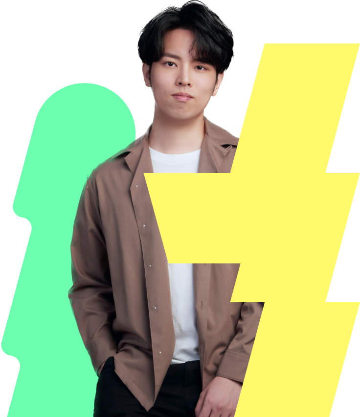
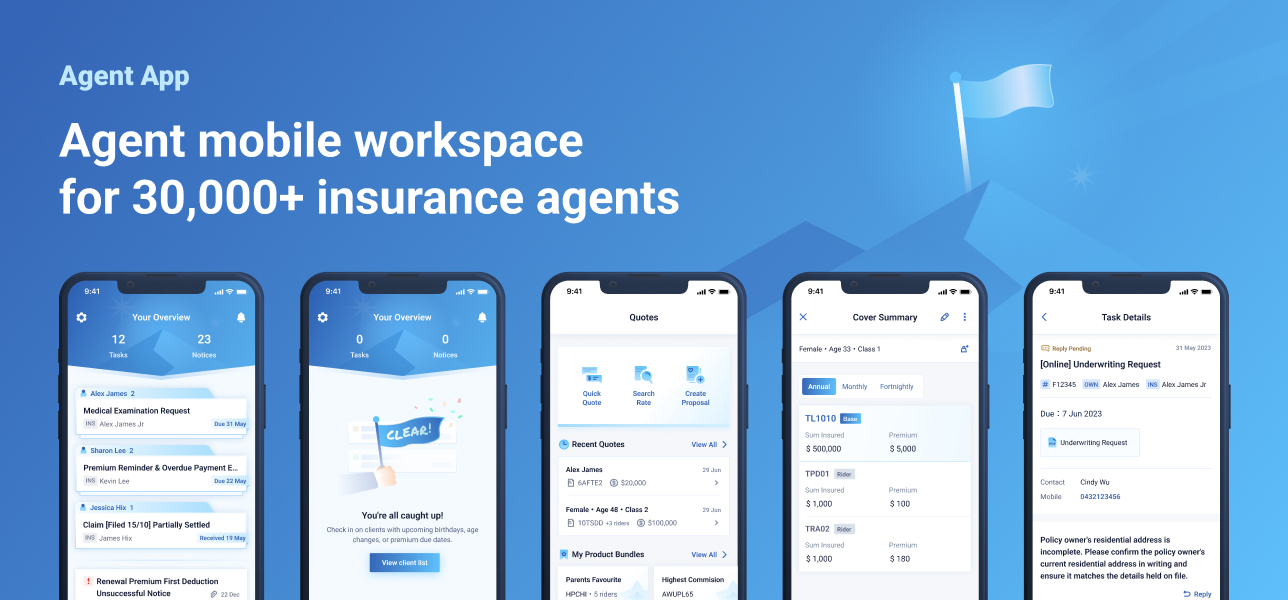
An Agent App that
Mirrors the Sales Mind
A mobile workspace app for 30,000+ agents at Taiwan's leading insurance corporation.


The creation of a
agent mobile workspace
Background
One of Taiwan's largest insurance providers, supported by a field force of more than 30,000 agents, had seen its digital ecosystem evolve into a fragmented mix of desktop systems and mobile workarounds.
Agents often relied on personal spreadsheets, handwritten notes, and multiple apps just to manage a single client visit.
We were commissioned to redesign the experience, repositioning mobile as the core platform for an agent's daily workflow rather than a secondary extension of desktop systems.
Achievement
What we actually delivered.
- 01
Translated a complex desktop process into a streamlined mobile experience.
10+→3 desktop steps compressed into three mobile taps — the policy-lookup flow agents reach for most.
- 02
Consolidated business, regulatory, security and IT perspectives into agreed design deliverables.
Cross-functional alignment across product, compliance, security and the client's IT — one design language signed off without escalation.
- 03
Delivered a design that won 0+ agents at the in-house app proposal seminar.
A live vote on the homepage concept by the field force themselves — the endorsement that locked in the final direction.
A highly professional and collaborative partner who demonstrates a strong understanding of user needs. Meticulous in analyzing the logic behind user feedback, they consistently deliver highly practical, creative design solutions with great attention to detail and flawless execution.
Problem Statement
How might we transform a bulky desktop portal into a fast, proactive partner for agents on the move?
Three important why
Why now?
A failed digital transformation had bruised client trust and shaken agent morale. The company needed a visible short-term win to proof they were listening and back on track.
Why us?
An external team with a fresh view could bridge the company and its agents in a way internal teams couldn't. Half the brief was design; the other half was making agents feel heard.
Why app?
The company assumed iPad. But 80% of an agent's day is in motion — between meetings, in cars, in cafés — where an iPad is too big. Mobile was the only device that fit the day.
Design Strategy
Collaborative UX:
designing with our agents
Our strategy was to design from where the agent stands, not from where we sit. We invited agents into the process extensively — as users with a clear voice, and also a domain knowledge stakeholder.
- 01Their voice, our pen
Agents joined the process as users, telling us what was broken, voting on what to fix first. They also act as a domain-knowledge expert, guiding us through the complexity of their daily work.
- 02Designed for their day
Anchor every flow to where agents actually work — between meetings, in cars, one-handed in a café — not to the desk-time most of them simply don't have.
- 03Wins they can feel
Ship small, visible improvements ahead of big invisible ones. Agents experience progress in their own routine instead of waiting through it — and trust returns the same way.
How We Got There
From listening, through insight, to direction.
Extensive user research synthesised into a core set of clustered insights, which defined the guiding principles for our entire UI/UX design.
14stakeholders
Stakeholder interviews
Across product, compliance, and regional teams — each lens revealing different constraints.
8agents · 3 wks
Shadowing & depth
Direct observation in real selling contexts. Where the workarounds — spreadsheets, screenshots, WhatsApp — surfaced.
20+agents
Co-design workshop
Hands-on co-creation. Agents mapped routines, prototyped layouts, prioritised pain points themselves.
600+agents
Live concept vote
A large-scale online conference where two homepage concepts were presented and put to a live agent vote.
Agents don't think by task type, they think by customer.
Every workaround they invented was a way to cluster work back around the person they were about to call.
Long travel between locations
Too many nested clicks
Repetitive logins
Hard-to-read interface
Notifications lack policy context
Information is hard to find
Want faster login
Reply to enquiries on the go
Want push notifications
On-the-spot quoting with clients
Quick client info lookup
Direct navigation to clients
Vision goal
Boost productivity,
make the time count.
make the time count.
Replace fragmented systems with one mobile workspace, so every minute on the road is meaningful work.
Vision goal
Earn client trust
through visible professionalism.
through visible professionalism.
Help agents look composed and prepared in front of clients, opening up cross-sell opportunities.
Vision goal
Capture the moment,
shorten the cycle.
shorten the cycle.
Compress the sales process. Get from first touch to closed deal faster — without losing nuance.
Key Features
Empowering the Agent's Day-to-Day
Replacing fragmented workarounds with unified, streamlined digital solutions.
01
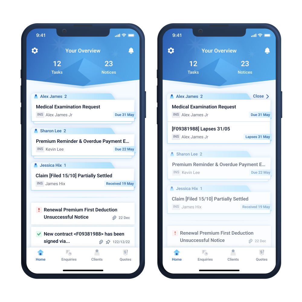
Homepage · Grouping complex tasks by clients
Group tasks by who needs serving, not by what kind of task it is.
Shadowing revealed that productivity drops when agents are forced to think in siloed task types. Their real workflow centres on the customer: every manual workaround they built—spreadsheets, screenshots, chat threads—was an effort to cluster information back around the client they were about to see.
The homepage mirrors this mental model by grouping tasks by client, acting as a strategic assistant for planning daily visits and calls. The interface reflects the way agents already naturally think—only made much faster.
“I'm about to call Mr Lee — what's outstanding for him?”
— Agent · shadowing session
Vision goal 01Boost productivity, make the time count
02
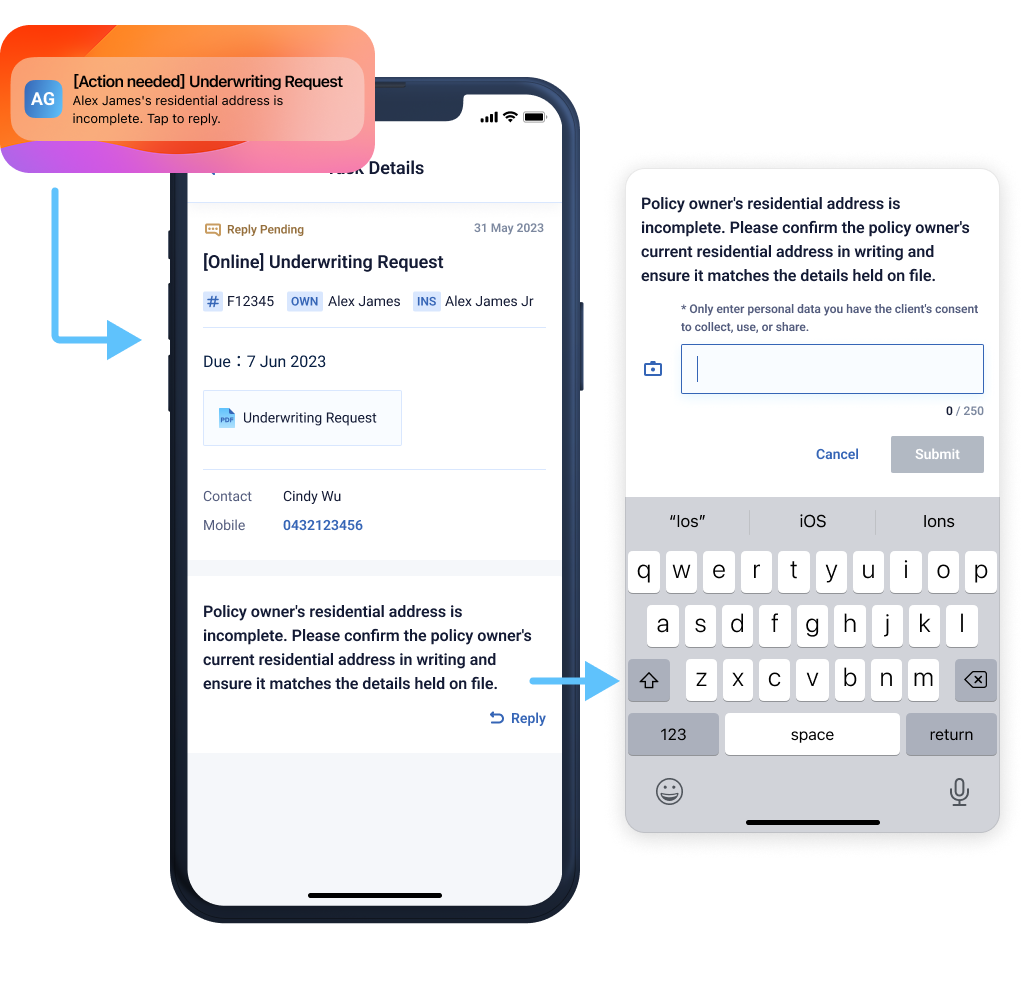
Inquiry · Real-time inquiry handling
Bring the inquiry to the agent
Resolving inquiries used to be a painful desktop ritual—requiring multi-factor portal logins, digging through client profiles, and tedious cross-device file transfers. Because agents spend 90% of their time on the move, this clunky workflow inevitably turned urgent client responses into dreaded after-hours office work. We broke this desk-bound bottleneck by bringing the entire inquiry ecosystem to mobile. Now, push notifications serve as the direct entry surface, carrying enough instant context for agents to triage, review, and act on critical alerts the moment they land.
The core design value shifts from passive tracking to instant resolution in the field. By embedding versatile response tools—including direct-camera photo capture and seamless file uploads—agents can resolve urgent compliance and policy matters right in front of the client. This feature exemplifies how we transformed the product from a generic task manager into a tailored, high-performance mobile office built for the realities of the field.
“I need my phone to actively push me the inquiry, and let me handle it online, anywhere.”
— Agent · depth interview
Vision goal 02Earn client trust through visible professionalism.
03
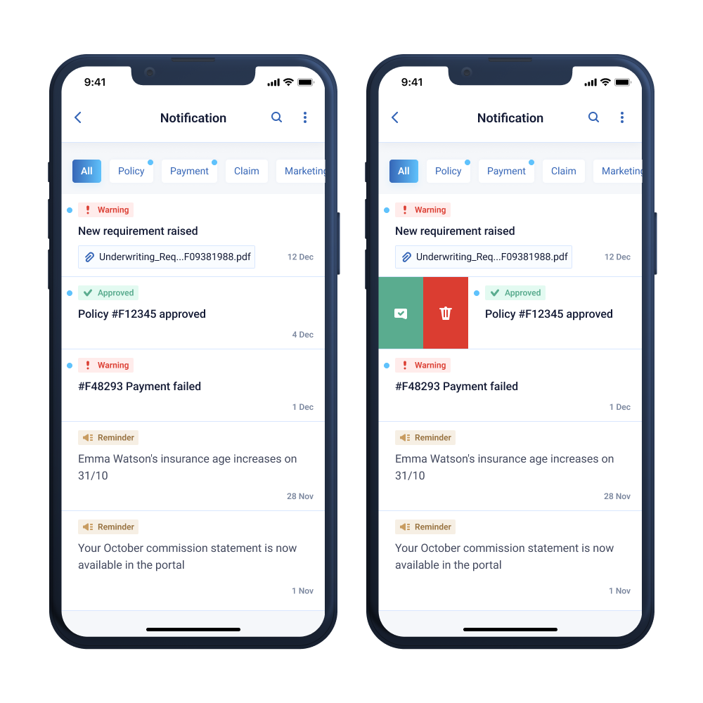
Notifications · Notification handling
Make notifications the front door, not the doorbell.
Head-office communications used to get lost in a bloated desktop portal, leaving agents stranded with 999+ unread alerts. We transformed this passive inbox into a mobile-first hub, using distinct visual archetypes for instant triage at a glance. To support high-mobility, one-handed use on the go, we introduced intuitive swipe gestures so agents can effortlessly pin or dismiss notifications while moving between appointments.
The core value lies in turning these sterile alerts into active business drivers. We embedded contextual `Next Steps`—like instant client messaging and policy deep-links—to turn passive data into immediate client touchpoints. Finally, robust batch-management tools eliminate the dreaded 999+ clutter, ensuring high-priority updates remain visible and manageable.
“I never want a critical alert to fall off my radar just because I was driving when it landed.”
— Agent · co-design workshop
Vision goal 01Boost productivity, make the time count
04
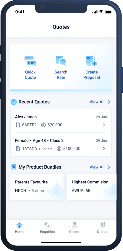
Live Quoting · Collapsing a multi-day workflow into on-the-spot mobile quoting
Build a quote at the table — turn the moment into a sale.
Sales happen in conversations—across a café table or mid-visit—when a client suddenly opens a window of opportunity. In insurance, striking while the iron is hot is everything; if the moment slips away, re-engaging the client takes twice the effort.
To capture this heat, we collaborated across business, compliance, security, and IT teams to transform a rigid, days-long desktop quoting process into an intuitive, 6-step mobile workflow. The platform maintains strict financial and legal rigor but empowers agents to build and share complex quotes on the spot. Once the moment is secured, the data seamlessly handshakes with existing backend platforms to generate formal proposals, ensuring the momentum of the sale is never lost.
- 01
Quotes hub
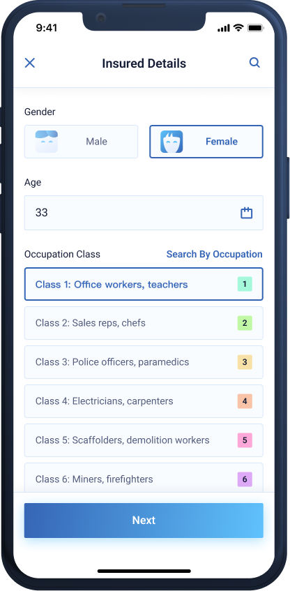
- 02
Capture the insured
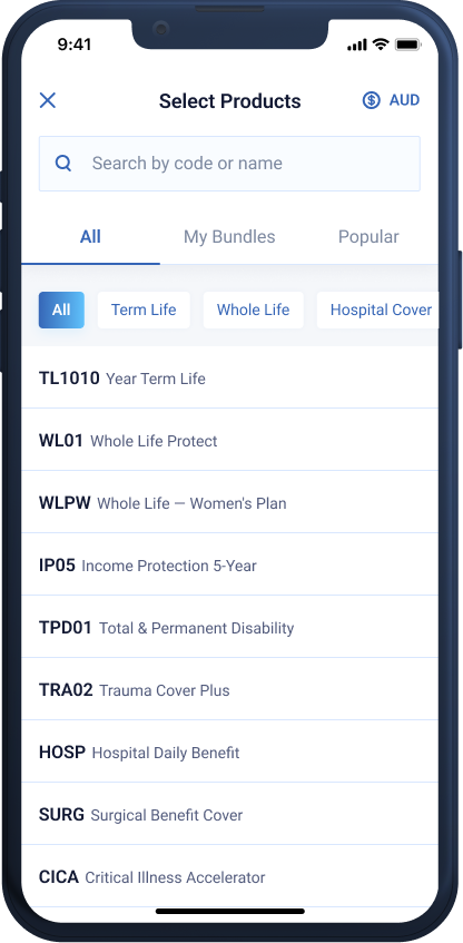
- 03
Pick the cover
- 04
Edit the cover
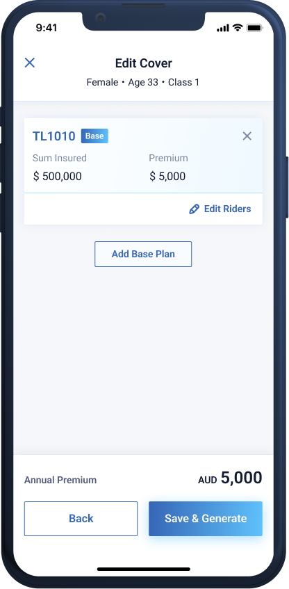
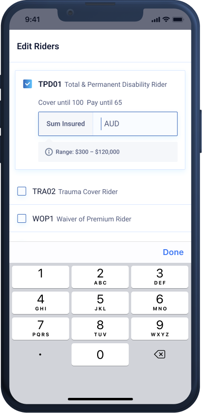
- 05
Tune the riders
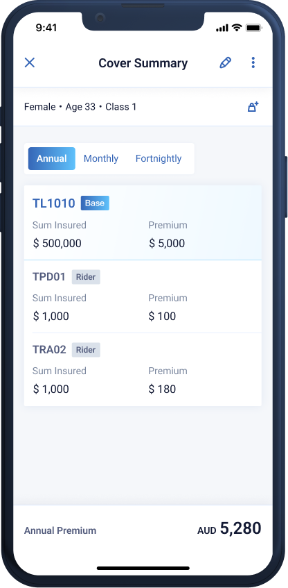
- 06
Cover Summary
“If I had to wait until I got back to the office, the moment was already gone.”
— Agent · Shadowing session
Vision goal 03Capture the moment, shorten the cycle
Design Concept
A partner on the road.
- Your partner to success
A visual language inspired by pursuit and progress, designed to support agents every step of the way.
- Fast & instant
Every key action is designed to resolve in seconds, making speed the core value of the mobile experience.
- Simple interaction
Designed for one-handed, in-the-moment use, with no nested menus, unnecessary decoration, or reliance on training.
Design System
Architecting a self-sustaining ecosystem
To ensure long-term product velocity and seamless handoff, the design system was architected as a self-sustaining framework. By codifying reusable components and strict design governance, we enabled internal teams to independently scale the platform and launch new workflows with complete visual and functional consistency.
01
Typography
To optimize performance and native rendering, the design system utilizes system-default typefaces: SF Pro and Roboto for English, paired with PingFang TC and Noto Sans TC for Traditional Chinese. Matching typographic ratios across iOS and Android ensures a seamless visual weight and brand voice regardless of the device.
To support an aging agent demographic, the system prioritizes legibility over decoration. We anchored the core body text at a minimum baseline of 16px and engineered an adaptive large-text mode, ensuring critical financial data remains readable under any field conditions.

02
Colour
We translated the corporate brand palette into a digital-first framework rooted in semantic design tokens. Colors are named strictly by their functional role and interaction context rather than their visual hue. This forces both designers and developers to choose colors based on systemic purpose, asking "what role does this play?" rather than "what does it look like?"
Beyond cross-platform alignment, this semantic logic establishes a strict color-coding system that provides intuitive interaction cues for field agents. Six shadow tokens follow the exact same functional naming architecture, reinforcing consistent depth, hierarchy, and system-wide predictability without adding visual noise.
Foreground · Text & icon
fg / default
#131A34
fg / medium
#535C7D
fg / low
#7C889F
fg / high · int
#3565B6
fg / danger
#DB3D31
fg / warning
#96703D
fg / success
#5AAC8F
fg / inverted
#FFFFFF
Background · Surfaces
bg / default
#F5F7FA
bg / medium
#FFFFFF
bg / high
#F4FAFF
bg / int-medium
#FFF → #AFE0FE
bg / int-high
#3565B6 → #5FC2FC
bg / inverted
#131A34
bg / modal
rgba(19,26,52,.65)
border / default
#D9E7FE
Status · Reserved for state, not decoration
STATUS
danger
#FFECEB
STATUS
warning
#F6EFE4
STATUS
success
#E3FAF1
STATUS
notice
#D9E7FE
STATUS
canceled
#DAE1EA
Shadow tokens · all keyed to brand blue
shadow / card
0 0 15px rgba(53,101,182,.10)
shadow / mini-action
0 0 6px rgba(53,101,182,.05)
shadow / input-active
0 4px 12px rgba(95,194,252,.15)
shadow / button
0 4px 20px rgba(95,194,252,.50)
shadow / nav
0 4px 15px rgba(19,26,52,.05)
shadow / nav-inverted
0 -4px 15px rgba(19,26,52,.05)
03
Iconography
To blend brand identity with clean utility, we established a tiered iconography framework based on interaction context. Icons scale through three distinct design principles: simple monochrome lines for inline labels, color-coded variants to signal interactivity, and rich chromatic gradients for high-visibility touchpoints like the tab bar. This ensures the icon system acts as an intuitive navigation cue rather than mere decoration.
To guarantee perfect visual consistency, every icon is engineered on a strict construction grid with keyline guides. Because different geometric shapes (circles, squares, rectangles) naturally carry different visual weights, this framework standardizes the boundaries so that any team member can scale and extend the icon set while maintaining a flawless, unified optical balance.
20 px · Monochrome line


24 px · Interactable


24 px · Display


04
Components
The component library transforms our "simple interaction" concept principle into structural reality. Every element is deliberately styled to enforce information hierarchy—amplifying core touchpoints through the brand gradient while softening secondary controls to reduce cognitive load for agents in the field.
To ensure seamless execution, all components feature strictly documented states (default, active, disabled, error). Form inputs are unified to surface inline range hints and validation copy within the exact same footprint, delivering real-time feedback and preventing post-submission frustration.

05
Cards
Modular scalability is the core engine of this design system. By combining structured card blueprints with predefined typography and color tokens, we created a versatile component matrix. This allows the interface to easily scale and adapt to complex insurance logic and diverse content requirements while maintaining absolute brand consistency.

06
Illustrations
Illustrations serve as the emotional anchor of our design concept, projecting an optimistic, success-driven brand voice through flat geometry and the core blue-gradient palette. For instance, rather than showing a dull, grayscale empty state when tasks are cleared, the homepage deploys a celebratory "finish" flag illustration—actively rewarding the agent’s hard work and reinforcing positive momentum.
Conversely, error, alert, and empty states are meticulously calibrated to deliver clarity without causing visual fatigue. By layering muted gray baselines with subtle, color-coded accent elements, the system communicates critical system status effectively. This prevents large blocks of alarming color from overwhelming the user, turning stressful errors into calm, manageable moments.

* All screens in this case study have been recreated to safeguard client privacy.
Let’s Create Miracle
Together !
UI/UX Designer &